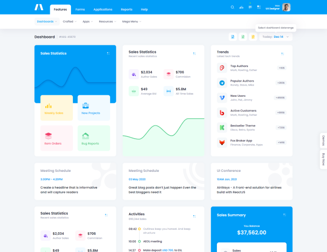
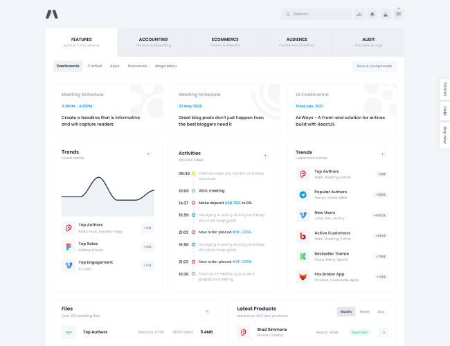
Overview
src/sass/components/_variables.scssand adds additonal options in
src/sass/components/_card.scss/.Basic Card
Title
<div class="card shadow-sm">
    <div class="card-header">
        <h3 class="card-title">Title</h3>
        <div class="card-toolbar">
            <button type="button" class="btn btn-sm btn-light">
                Action
            </button>
        </div>
    </div>
    <div class="card-body">
        Lorem Ipsum is simply dummy text...
    </div>
    <div class="card-footer">
        Footer
    </div>
</div>
Card Scroll
.card-scrolland
height classes
.h-{size}on a card's body to have a card with scrollable content:Title
Lorem Ipsum is simply dummy text of the printing and typesetting industry. Lorem Ipsum has been the industry's standard dummy text ever since the 1500s, when an unknown printer took a galley of type and scrambled it to make a type specimen book. It has survived not only five centuries, but also the leap into electronic typesetting, remaining essentially unchanged. It was popularised in the 1960s with the release of Letraset sheets containing Lorem Ipsum passages, and more recently with desktop publishing software like Aldus PageMaker including versions of Lorem Ipsum.
Lorem Ipsum is simply dummy text of the printing and typesetting industry. Lorem Ipsum has been the industry's standard dummy text ever since the 1500s, when an unknown printer took a galley of type and scrambled it to make a type specimen book. It has survived not only five centuries, but also the leap into electronic typesetting, remaining essentially unchanged. It was popularised in the 1960s with the release of Letraset sheets containing Lorem Ipsum passages, and more recently with desktop publishing software like Aldus PageMaker including versions of Lorem Ipsum.
Lorem Ipsum is simply dummy text of the printing and typesetting industry. Lorem Ipsum has been the industry's standard dummy text ever since the 1500s, when an unknown printer took a galley of type and scrambled it to make a type specimen book. It has survived not only five centuries, but also the leap into electronic typesetting, remaining essentially unchanged. It was popularised in the 1960s with the release of Letraset sheets containing Lorem Ipsum passages, and more recently with desktop publishing software like Aldus PageMaker including versions of Lorem Ipsum.
<div class="card shadow-sm">
    <div class="card-header">
        <h3 class="card-title">Title</h3>
        <div class="card-toolbar">
            <button type="button" class="btn btn-sm btn-light">
                Action
            </button>
        </div>
    </div>
    <div class="card-body card-scroll h-200px">
        Lorem Ipsum is simply dummy text...
    </div>
    <div class="card-footer">
        Footer
    </div>
</div>
Collapsible Card
.collapseplugin to enable quick collapsible cards. For more info, please refer to the
official documentation.Title
<div class="card shadow-sm">
    <div class="card-header collapsible cursor-pointer rotate" data-bs-toggle="collapse" data-bs-target="#kt_docs_card_collapsible">
        <h3 class="card-title">Title</h3>
        <div class="card-toolbar rotate-180">
            <span class="svg-icon svg-icon-1">
                ...
            </span>
        </div>
    </div>
    <div id="kt_docs_card_collapsible" class="collapse show">
        <div class="card-body">
            Lorem Ipsum is simply dummy text...
        </div>
        <div class="card-footer">
            Footer
        </div>
    </div>
</div>
Flush Borders
.card-flushclass to remove a card header and footer borders:Title
<div class="card card-flush shadow-sm">
    <div class="card-header">
        <h3 class="card-title">Title</h3>
        <div class="card-toolbar">
            <button type="button" class="btn btn-sm btn-light">
                Action
            </button>
        </div>
    </div>
    <div class="card-body py-5">
        Lorem Ipsum is simply dummy text...
    </div>
    <div class="card-footer">
        Footer
    </div>
</div>
Reset Side Paddings
.card-px-0to reset a card header, body and footer's side paddings:Title
<div class="card card-px-0 shadow-sm">
    <div class="card-header">
        <h3 class="card-title">Title</h3>
        <div class="card-toolbar">
            <button type="button" class="btn btn-sm btn-light">
                Action
            </button>
        </div>
    </div>
    <div class="card-body">
        Lorem Ipsum is simply dummy text...
    </div>
    <div class="card-footer">
        Footer
    </div>
</div>
Bordered Style
.card-borderedto a card to remove it's shadow and enable borders.Title
<div class="card card-bordered">
    <div class="card-header">
        <h3 class="card-title">Title</h3>
        <div class="card-toolbar">
            <button type="button" class="btn btn-sm btn-light">
                Action
            </button>
        </div>
    </div>
    <div class="card-body">
        Lorem Ipsum is simply dummy text...
    </div>
    <div class="card-footer">
        Footer
    </div>
</div>
Dashed Style
.card-dashedto a card to remove it's shadow and enable dashed style borders.Title
<div class="card card-dashed">
    <div class="card-header">
        <h3 class="card-title">Title</h3>
        <div class="card-toolbar">
            <button type="button" class="btn btn-sm btn-light">
                Action
            </button>
        </div>
    </div>
    <div class="card-body">
        Lorem Ipsum is simply dummy text...
    </div>
    <div class="card-footer">
        Footer
    </div>
</div>
Card Stretch
.card-{mode}or responsive
.card-{breakpoint}-{mode}for
sm,
md,
lg,
xl, and
xxl.modeis one of:
-
stretch- for setting 100% stretch height -
stretch-75- for setting 75% stretch height -
stretch-50- for setting 50% stretch height -
stretch-33- for setting 33.333% stretch height -
stretch-25- for setting 25% stretch height
Height 100%
Height 50%
Height 50%
Height 33.333%
Height 33.333%
Height 33.333%
<div class="row g-5">
    <div class="col-lg-4">
        <div class="card card-stretch card-bordered mb-5">
            <div class="card-header">
                <h3 class="card-title">Height 100%</h3>
            </div>
            <div class="card-body">
                Lorem Ipsum is simply dummy text
            </div>
            <div class="card-footer">
                Footer
            </div>
        </div>
    </div>

    <div class="col-lg-4">
        <div class="card card-stretch-50 card-bordered mb-5">
            <div class="card-header">
                <h3 class="card-title">Height 100%</h3>
            </div>
            <div class="card-body">
                Lorem Ipsum is simply dummy text
            </div>
            <div class="card-footer">
                Footer
            </div>
        </div>

        <div class="card card-stretch-50 card-bordered mb-5">
            <div class="card-header">
                <h3 class="card-title">Height 100%</h3>
            </div>
            <div class="card-body">
                Lorem Ipsum is simply dummy text
            </div>
            <div class="card-footer">
                Footer
            </div>
        </div>
    </div>

    <div class="col-lg-4">
        <div class="card card-stretch-33 card-bordered mb-5">
            <div class="card-header">
                <h3 class="card-title">Height 33.333%</h3>
            </div>
            <div class="card-body">
                Lorem Ipsum is simply dummy text
            </div>
            <div class="card-footer">
                Footer
            </div>
        </div>

        <div class="card card-stretch-33 card-bordered mb-5">
            <div class="card-header">
                <h3 class="card-title">Height 33.333%</h3>
            </div>
            <div class="card-body">
                Lorem Ipsum is simply dummy text
            </div>
            <div class="card-footer">
                Footer
            </div>
        </div>

        <div class="card card-stretch-33 card-bordered mb-5">
            <div class="card-header">
                <h3 class="card-title">Height 33.333%</h3>
            </div>
            <div class="card-body">
                Lorem Ipsum is simply dummy text
            </div>
            <div class="card-footer">
                Footer
            </div>
        </div>
    </div>
</div>
Utility Classes
.card-{property}class on other elements to required card style properties defined through the SASS variables in
src/sass/components/_variables.scssand
src/sass/components/_card.scss/.propertyis one of:
-
p- to set paddings from card -
px- to set left and right paddings of card -
py- to set top and bottom paddings of card -
card-rounded- to set border radiuses of card -
card-rounded-top- to set top left and top right radiuses of card -
card-rounded-bottom- to set bottom left and top right radiuses of card
Fluid Image

<div class="card shadow-sm">
    <div class="card-header">
        <h3 class="card-title">Fluid Image</h3>
        <div class="card-toolbar">
            <button type="button" class="btn btn-sm btn-light">
                Action
            </button>
        </div>
    </div>
    <div class="card-body p-0">
        <div class="card-p mb-10">Lorem Ipsum is simply dummy text of the printing and typesetting industry.</div>

        <div class="text-center px-4">
            <img class="mw-100 mh-300px card-rounded-bottom" alt="" src="examples.png"/>
        </div>
    </div>
</div>


